YouTube Shorts Safe Zone Dimensions 2026 (1080×1920): Pixel Margins + Where the Subscribe Button Sits
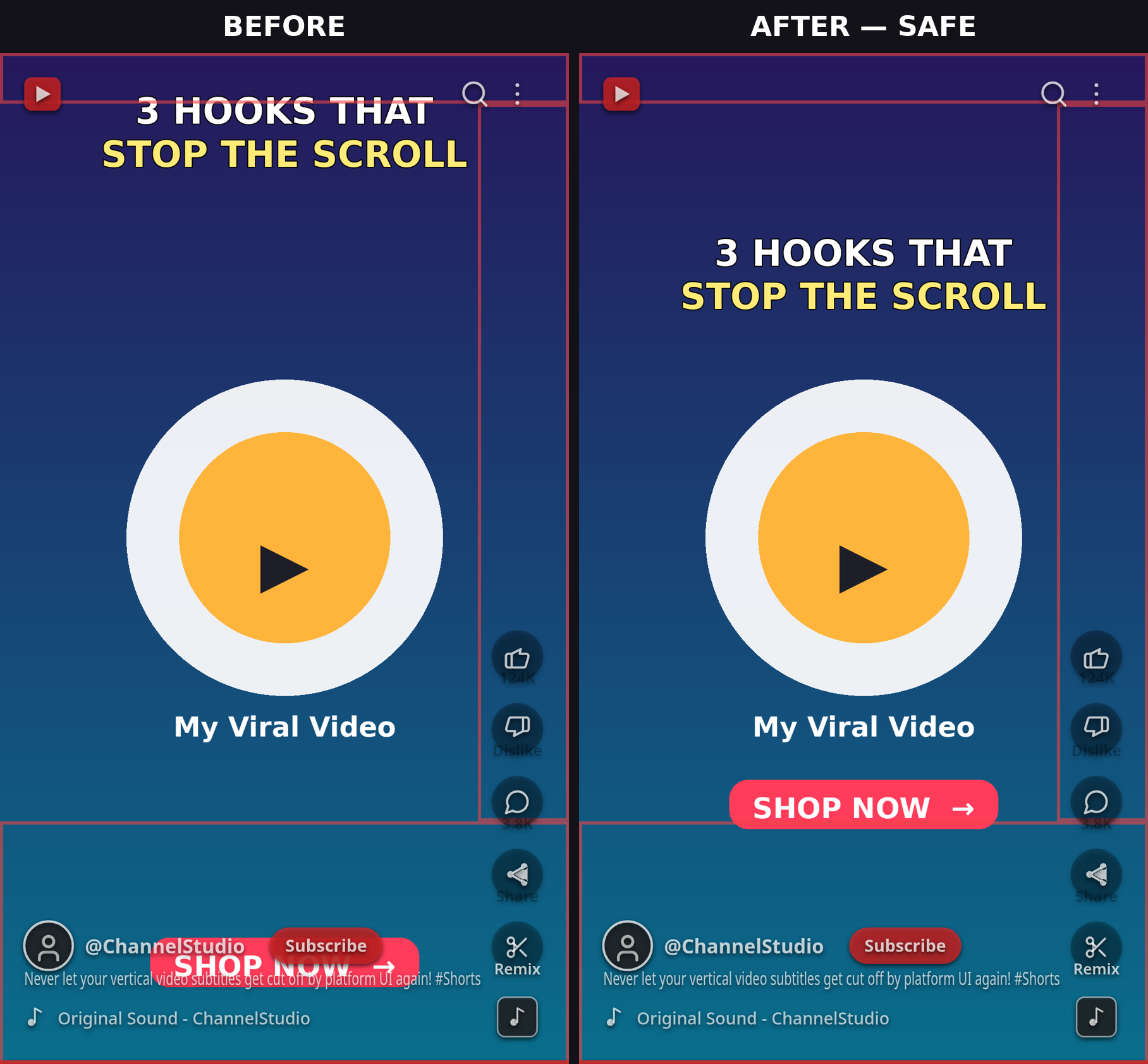
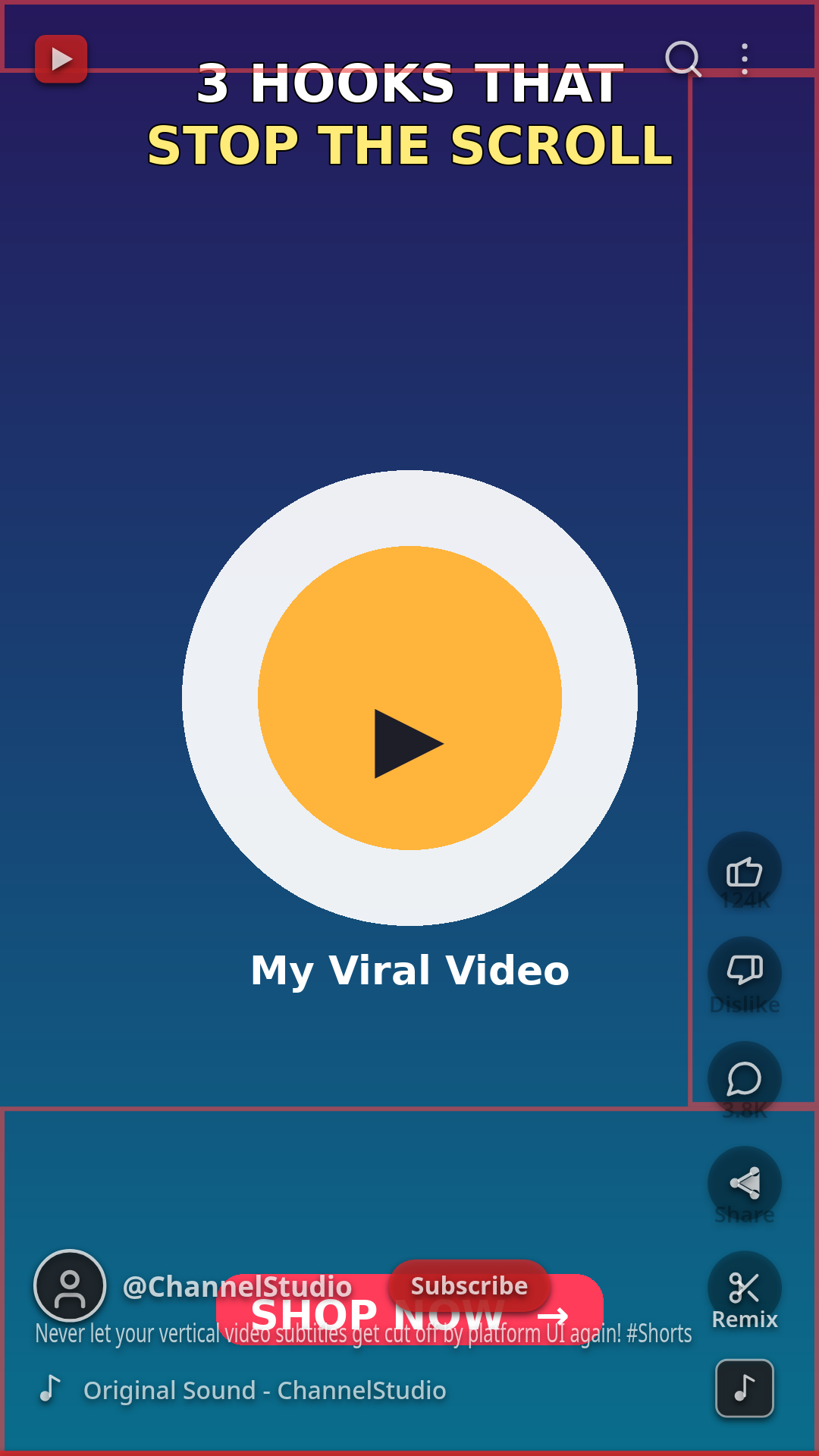
Shorts have a different threat profile than TikTok or Reels. The top and sides are relatively calm, but the bottom-right corner is the most dangerous patch of screen real estate in short-form video: the channel name, title/description, a subscribe button that's bigger and more prominent in 2026 than ever, and the like/comment/share/remix rail all stack into the same corner. A layout that's safe on TikTok can still get its CTA eaten by Shorts' subscribe button.
This guide gives you the 2026 YouTube Shorts safe zone dimensions for a standard 1080×1920 (9:16) Short: the pixel margins to keep clear, exactly where each UI element sits, why the expanded description moves the danger zone, where to place text and faces so they survive, and how to build one layout that's safe on Shorts, TikTok, and Reels.
Quick check: if you'd rather verify than measure, run your frame through ReelGuard's free Shorts safe zone checker — select YouTube Shorts and it overlays the UI zones, the subscribe button footprint, and the expanded-description state on your footage in your browser. Nothing is uploaded; everything runs locally.
The Shorts Safe Zone in 2026: Pixel Margins at a Glance
On a 1080×1920 px Short, keep critical content — text, faces, logos, CTAs — clear of these zones:
| Edge | Conservative | Practical organic | What covers it |
|---|---|---|---|
| Top | ~180 px (9.4%) | ~120–150 px | Search, cast, camera icons, options menu, phone notch / Dynamic Island |
| Bottom | ~360–390 px (~20%) | ~280–300 px | Channel name, subscribe button, title, audio track label |
| Bottom (description expanded) | ~400 px | ~400 px | Title + description grow upward when a viewer taps to expand |
| Left | ~80 px | ~48–60 px | Edge buffer — curved screen corners and pinch of the frame |
| Right | ~150–160 px | ~96–120 px | Like, dislike, comment, share, remix rail + sound disc |
Resulting safe area (conservative): roughly 840 × 1350 px, centered in the frame. Resulting safe area (practical organic): roughly 900 × 1440 px, in the upper-middle of the frame.
Why two columns? YouTube publishes no official Shorts safe zone spec — unlike Meta's published percentages for Reels, every number here is a working range measured from the live app. The conservative column uses the widest margins across 2026 guides (flowshorts.app, hopperhq.com, paidmediaworld.com); the practical column reflects what the collapsed-description organic player actually shows. Ranges, not fake precision — YouTube's UI shifts slightly between app versions, and the subscribe button grew in 2026.
Sources: conservative margins compiled from flowshorts.app (180 top / 390 bottom / 60 sides → ~960×1350), hopperhq.com (same spec, ~900×1350 safe), paidmediaworld.com's CSS pixel boundary guide (180 top / 360 bottom / 160 right / 80 left → optimum focal box X 80–920, Y 220–1500), and recast.studio's conservative rule (250 top / 400 bottom / 150 right / 60 left, checked October 2026). Practical margins from postplanify.com's 2026 Shorts checker (~120 top / 300 bottom / 96 right / 48 left → ~888×1500) and socialez.com's 2026 specs (150 top / 250–300 bottom / 160 right / 60 left).
The Subscribe Button Trap (New in 2026)
The subscribe button is Shorts' signature coverage hazard — and it got bigger and more prominent in 2026. It sits in the bottom-right corner, just above the channel name strip, and occupies roughly 180 × 80 px. Anything in that corner — a logo bug, a "subscribe" graphic of your own, a promo code, a burned-in CTA — gets covered by YouTube's own subscribe button.
This is the mistake crossposters make most: TikTok's bottom-right corner is covered by its caption zone, so TikTok-safe layouts already keep text low-center — but the Shorts subscribe button sits higher and wider than most creators expect. A watermark or CTA sitting at X 950, Y 1500 is fine on TikTok and dead on Shorts.
Rule: keep the bottom-right quadrant of the lower strip — roughly X 860–1080, Y 1450–1650 — empty of anything you care about.
The Expanded-Description Trap
Here's the moving target: when a viewer taps your title to expand the description, the bottom overlay grows from ~300 px to roughly 400 px. The title, description, and audio attribution stack upward and swallow another ~100 px of your frame.
Design for the expanded state, not the collapsed one. If your CTA or key text sits at Y 1600, it's visible in the feed — and hidden the moment someone reads your description. Keep must-see content above Y ~1500 and you survive both states.
Where to Put Text, Faces, and CTAs on Shorts
Hook text goes in the upper-middle band, roughly Y 250–700 — below the top icon bar, above the danger corner, and readable at a glance. Shorts' top is calmer than Reels', so you can safely sit hooks slightly higher here than on Reels.
Burned-in subtitles should sit between 40–50% of frame height (Y ~770–960), ending before X ~880 so lines clear the action rail. Never let the lowest line drop below Y ~1450 — the expanded description will take it.
Faces and key product shots belong center or center-left. Never the bottom-right — that's the subscribe button's territory (see above), plus the rail's sound disc above it.
CTAs go center or center-left, above the description-expansion line (Y ~1450). And on Shorts specifically: don't make your own "subscribe" graphic — YouTube's button already does that job and it will cover yours. Spend the pixels on the reason to subscribe (the hook), not the word.
Shorts thumbnails/covers: custom thumbnails upload at 1080×1920, but on your channel page the Shorts shelf shows only the center square of the cover. Design the key frame inside the center 1080×1080 band so it reads on the shelf too.
One Layout for All Three Platforms
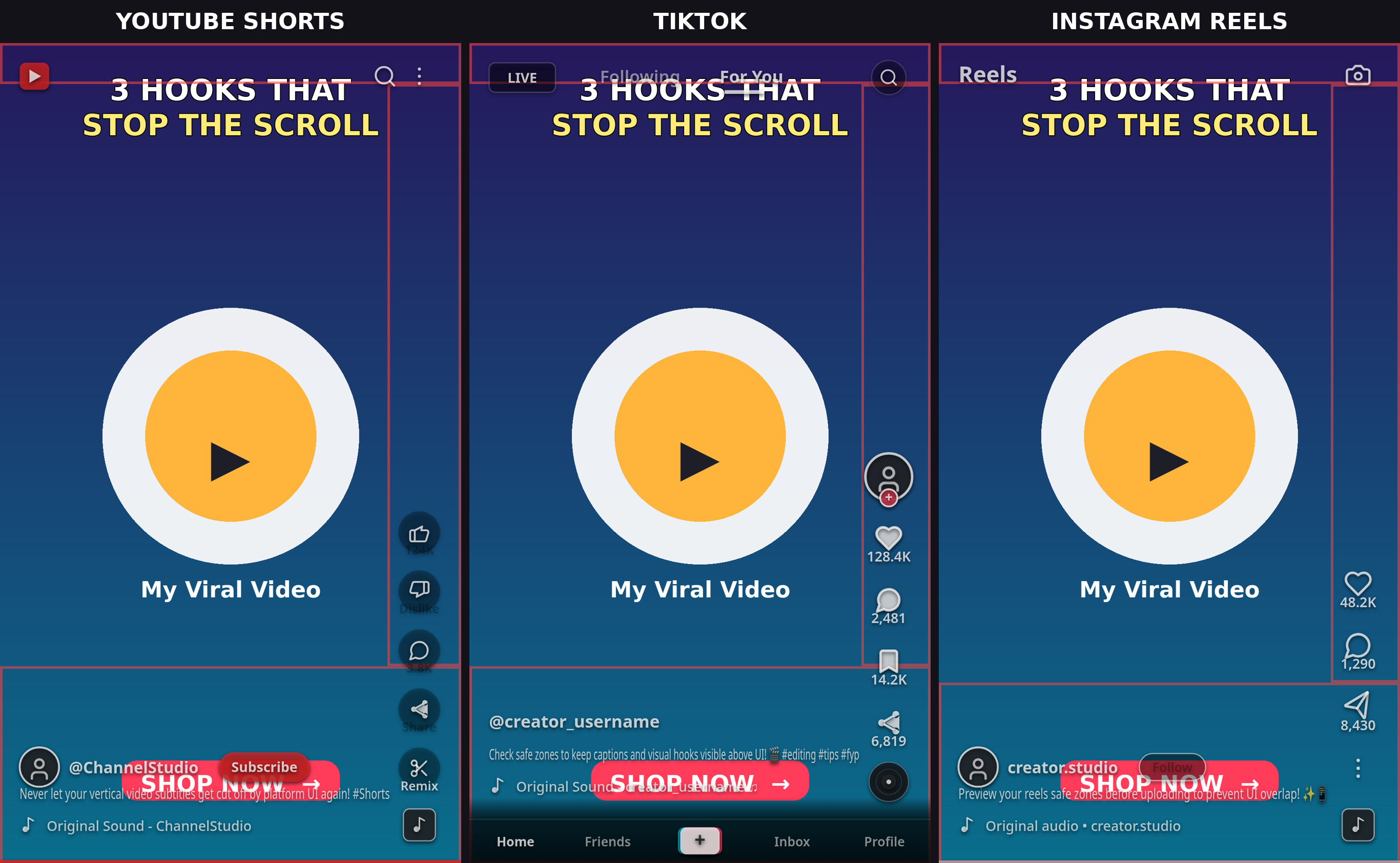
If you crosspost — and you should — here's how the three safe zones compare at 1080×1920, using the conservative column from each guide:
| Edge | TikTok | Reels | Shorts |
|---|---|---|---|
| Top | ~140 px | ~270 px | ~180 px |
| Bottom | ~300–350 px | ~670 px | ~360–390 px |
| Right | ~90–100 px | ~65 px (~227 px corner) | ~150–160 px |
| Left | ~60 px | ~65 px | ~80 px |
The intersection — the box safe on all three — is roughly X 80–920, Y 390–1230. That's smaller than any single platform's safe zone, and it's exactly where most creators under-shoot. In plain terms: keep must-see content in the center 840×840 px box, upper-middle of the frame. Design to that box and the same video survives TikTok, Reels, and Shorts without re-editing.
(Detailed per-platform guides: TikTok safe zone dimensions 2026 · Instagram Reels safe zone dimensions 2026.)
5 Mistakes That Get Shorts Text Covered
- A "subscribe" graphic in the bottom-right. YouTube's own subscribe button covers it — the corner is wasted pixels.
- CTAs below Y ~1450. Fine when the description is collapsed; hidden when a viewer expands it.
- Text ending at the right edge. The action rail eats ~150 px — keep every line's end before X ~880.
- Assuming TikTok-safe = Shorts-safe. Shorts' bottom margin and right rail are both wider than TikTok's; the subscribe button has no TikTok equivalent.
- Tiny fonts. Minimum 24 px for any on-screen text at 1080×1920 — below that, phone screens and compression make text unreadable regardless of placement.
How to Check Your Short in 30 Seconds (Free)
- Open ReelGuard and select YouTube Shorts.
- Drop in a frame of your video or a thumbnail.
- Toggle the subscribe button footprint and expanded description overlays — if any text, face, or logo falls in a shaded zone, move it and check again. Repeat for TikTok and Reels if you crosspost.
The whole thing runs in your browser — your footage never uploads anywhere.
FAQ
What are the YouTube Shorts safe zone dimensions in 2026? On a 1080×1920 Short, keep ~180 px clear at the top, ~360–390 px at the bottom (400 px when the description is expanded), ~150–160 px on the right, and ~80 px on the left — a roughly 840×1350 px safe area. For everyday organic posts, ~120–150 px top, ~280–300 px bottom, and ~96–120 px right is enough in practice.
Where is the subscribe button on YouTube Shorts? In the bottom-right corner, above the channel name strip — roughly a 180×80 px footprint in 2026, bigger and more prominent than previous years. Keep logos, watermarks, and CTAs out of the bottom-right quadrant.
Why does my Short's text disappear when someone reads the description? Tapping the title expands the description, growing the bottom overlay to ~400 px. Design for the expanded state: keep must-see content above Y ~1500 on a 1080×1920 frame.
Is the Shorts safe zone the same as TikTok's? No. Shorts reserves more bottom space and a wider right rail than TikTok, and the subscribe button has no TikTok equivalent. Design to the cross-platform box (X 80–920, Y 390–1230) and one layout survives all three.
What size should a YouTube Shorts thumbnail be? 1080×1920 px (9:16), under 2 MB — but note the channel's Shorts shelf shows only the center square, so keep the key frame inside the center 1080×1080 band.
How can I check my Shorts safe zone for free? Use ReelGuard's free safe zone checker: select YouTube Shorts, drop in a frame, and toggle the UI-zone, subscribe-button, and expanded-description overlays. It runs entirely in your browser — nothing uploads.